
According to Google, images are beyond critical for SEO, overall user experience, website “stickiness,” and retaining visitors in a world where the average online attention span is a mere eight seconds.
Seems obvious, but you’d be surprised how effective image optimization can be for SEO. Especially when you consider close to 90% of data the brain transmits is visual.
Don’t believe us? Here’s a thought experiment for you: try recalling the latest eCommerce site you visited. What jumps to mind? Product description and specs or the look and feel of the site as a whole (lifestyle and studio product photography, macro imagery, etcetera)? Makes sense, right?
Well, this is by no means an accident but rather purposeful. And behind all these crisp, colorful, and high-resolution images is SEO optimization—playing a pivotal role in driving qualified users—like yourself—to the site.
Why Does SEO Image Optimization Matter?
While you may already know the answer to this question, it’s important to understand why and how image optimization affects not only SEO, but also overall site health. Large and unruly images served across all devices without the help of a CDN (Content Delivery Network) can severely impede user experience, time on site, conversions, and ultimately site rankings in the SERPS.
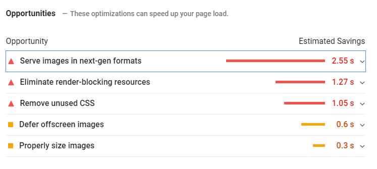
Pro tip: With Google Pagespeed Insights, you can see which opportunities are available to improve your site’s speed, with image optimization being a major component.
All that said, we found it prudent to outline some best practices for SEO image optimization across your site to help mitigate any unforeseen challenges due to slow loading times, the inability of crawlers to index site content appropriately, and poor UX for your visitors.
Image Optimization Best Practices for SEO
Choose the best format
By now it’s safe to assume we’re all somewhat familiar with basic image formats across the web. We’re talking your standard GIF, PNG, and JPEG images found ubiquitously upon sites of all sizes and denominations (For the sake of space and clarity we’ll keep things as simple as possible with these three formats. However, we are aware of the versatility and applicability surrounding JPEG XR and WebP image formats as well).
That said, the selection of a format should be determined by the image’s intended function.
Is animation needed to boost engagement and convey a specific message? Go with the GIF.
Is the highest image quality necessary? PNG might be the best bet.
JPEGs, then, are typically the preferred format for preserving most of the image detail while simultaneously reducing file size—ideal for site speed and load times.
No matter what format you decide upon, it’s important to optimize the size of each image to reduce site lagging. There’s a handful of third-party tools available to accomplish this such as exgif, optipng, and pngquant.
Resize your images appropriately
When developing the front-end of your site, ensuring a maximum width for each image load is key to preventing an oversized image from slowing down the site load time.
Put simply, imagine a hero image that’s 5000px wide, yet your site width doesn’t exceed 1200px.
The image will still be served within the constraints of the site. However, loading all 5000px will significantly slow the site down.
The solution? Resize and upload the images within the maximum width you need. And if you aren’t sure what that is, have your designer dig into the CSS to find out.

The only caveat here is to take extra care in resizing these images if you’re using a responsive design. So be sure to check with your front-end designer to ensure whatever max width you’re resizing to falls in line with the responsive nature of the site.
Name your images appropriately
Ask any web designer or content manager and they’ll relay the importance of naming conventions for images across the site. Not only does this keep everything organized on the backend but—more importantly—Google uses filenames to index the image subject matter.
For example, space-gray-macbook-pro.jpg is much easier to crawl and index than img000456.jpg.
What’s also pertinent here are descriptive alt texts for each image.
As a refresher, alt text (i.e. alternative text) serves as an image descriptor (what the browser displays to users with screen readers, and when the image cannot load properly).
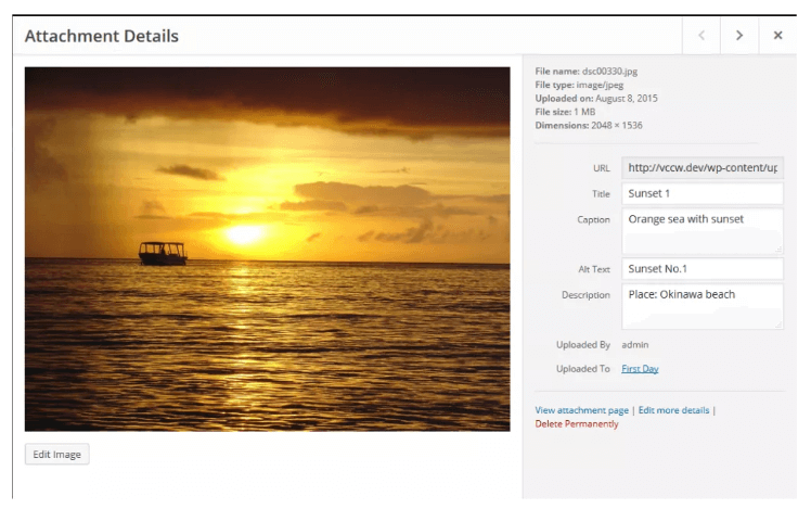
Additionally, captions provide useful information to Google for indexing purposes, so it only makes sense to include as much straightforward information as possible to help enhance visibility.
Manage the file size of each image
As previously stated, JPG, PNG, and GIFs make up the “big three” image formats outlined on the web. They all feature a different compression method.
Why does this matter?
It matters because the compressed file size of each image can differ greatly from one another—which can have a direct impact on site speed and load times. In fact, Google has confirmed that site speed plays a crucial role in SERP rankings for both desktop and mobile.
So, it behooves you as an SEO, site owner, or content manager to opt for the smallest image file size possible while maintaining the greatest quality (the JPEG format often works best).
 For Mac users, imageoptim is a fantastic free tool for optimizing image sizes.
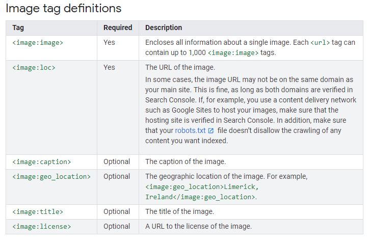
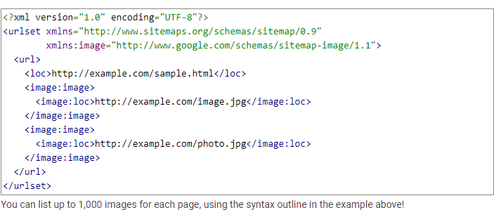
Create an image sitemap
Unless you’re using WordPress and Yoast SEO, odds are your images aren’t automatically added to your sitemap—a crucial step in providing Google additional details about your images they might not have otherwise captured by crawling the site.
More importantly, image sitemaps, unlike standard sitemaps, can contain URLs from other domains. This allows webmasters to use CDNs to host images, which allows for quicker image load time. It also enables Google Search Console to report any crawl errors found on the site once the CDN’s domain name is verified.
Make your images responsive for mobile
With a sizable, if not majority, of web traffic stemming from mobile, a slow site can be detrimental to respective rankings.
The key to mitigating any pains stemming from a slow site speed comes in the form of responsive image loading for mobile. Meaning, if you have a 1000px-wide image on your site but the mobile display is only 350px-wide, loading that extra 650px will waste bandwidth and prevent the page from loading quickly—which is not good for SEO.
Luckily, there’s one snippet of HTML code that solves the issue: srcset. Here, this piece of code prompts the browser to load different image sizes for different display resolutions. So, with that 1000px-wide image, you can include different size options in the syntax so the rightfully-sized image is served on the respective display based on a specific device and screen size.
Some CMS’s (e.g. WordPress) automatically generate this code for the convenience of the user and offer a plugin to optimize images for retina displays when necessary.
We’ve only begun to scratch the surface of what comprehensive SEO image optimization can entail. Google and a variety of third party websites offer additional information on schema markup for images, the merits of using a CDN to enhance site load times, leveraging browser caching to reduce load times for sites with plentiful images, and even opting for “lazy loading”, where images are served only when they’re prompted to be shown on screen.
Needless to say, there are a myriad of tips and tricks out there to help optimize your image SEO and therefore your site experience, relevancy, and overall content, so research wisely.